

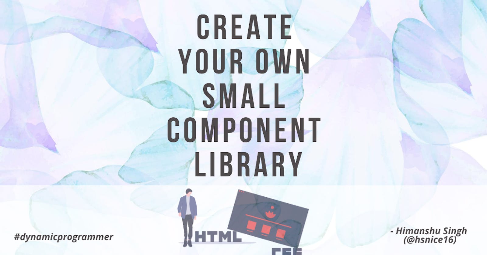
Create your own small component library
A component library is a set of reusable components.


Hello there,👋. In this blog, you will read How can you create your own small component library? And then you can use that for your small projects.
You will find the following sections in this blog -
Before starting our discussion, you should definitely check how it will look at the end. And you can check its full code too.
Final Look: check🚀
Github Code: check🚀
Lets we start now.
✔️ typography
The code of typography is the simplest one, all we have to do is write⌨️ only some basic HTML. I had not written any CSS for this, but you can write it if you wish.
typography is the art of arranging letters and text in a way that makes written language readable and appealing when displayed.
Its code will look something like this -
<h2>@typograpy</h2>

<h1>This is the largest heading</h1>
<h2>This is the second largest heading</h2>
<h3>This is the third largest heading</h3>
<h4>This is the forth largest heading</h4>
<h5>This is the fifth largest heading</h5>
<h6>This is the sixth largest heading</h6>

<p>This is a paragraph text</p>
<small>This is a small <strong>bold</strong> text</small>
And finally, it will look something like this -
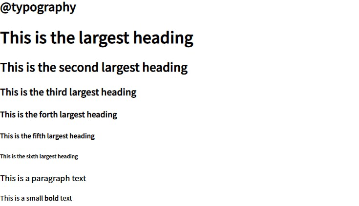 This is all that we have to do for typography. let us move on to our next section, containers.
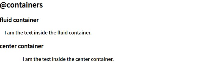
✔️ containers
In my viewpoint, mostly we use two types of containers.
fluid container :- this spreads from left end to right end.
center container :- And this, as the name suggests, spreads in the center.
The HTML code for containers has only 5 tags. So you can think, How simple it will be? And 5 tags will look like this -
<h2>@containers</h2>

<h3>fluid container</h3>
<div class="container">
     I am the text inside the fluid container.
</div>

<h3>center container</h3>
<div class="container container-center">
     I am the text inside the center container.
</div>
Okay okay, it has only 3 unique tags 😲.
We will style containers, as we have to spread a container in the center. And we will also give them some padding, so they look nice.
Its CSS code will look something like this -
/* containers */
.container {
    padding: 0rem 1rem;
}

.container-center {
    max-width: 600px;
    margin: auto;
}
And finally, it will look like this -
 We are done with containers too. Let us discuss links now.
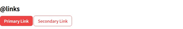
✔️ links
As of my knowledge, basically links are of two types :
The first one is, on which we want users to focus more, known as Primary Link.
And the second one is that on which we don't want users to focus more, known as Secondary Link.
Writing HTML code for this is very simple, we have to include anchor tags for this. And its code will look something like this -
<h2>@links</h2>

<a class="link link-primary" href="/">Primary Link</a>
<a class="link link-secondary" href="/">Secondary Link</a>
And when we style them, using the following codes -
/* links */
.link {
    text-decoration: none;
    padding: 0.5rem 1rem;
}

.link-primary {
    background-color: var(--primary-color);
    color: white;
    border-radius: 0.5rem;
}

.link-secondary {
    color: var(--primary-color);
    border: 1px solid var(--primary-color);
    border-radius: 0.5rem;
}
They look like this -
 We have completed the links. let's discuss lists now.
✔️ lists
For this small component library, I added only three types of lists.
- Unordered list(without bullets)
- Unordered inline list
- Reverse ordered list
The HTML codes for which is -
<h2>@lists</h2>

<h3>Unordered list(without bullets)</h3>
<ul class="list-non-bullet">
      <li>ul Item One</li>
      <li>ul Item Two</li>
      <li>ul Item Three</li>
</ul>

<h3>Unordered inline list</h3>
<ul class="list-non-bullet">
      <li class="list-item-inline">Item One</li>
      <li class="list-item-inline">Item Two</li>
      <li class="list-item-inline">Item Three</li>
</ul>

<h3>Reverse ordered list</h3>
<ol reversed>
      <li>ol Item One</li>
      <li>ol Item Two</li>
      <li>ol Item Three</li>
</ol>
Finally, it will look something like this -
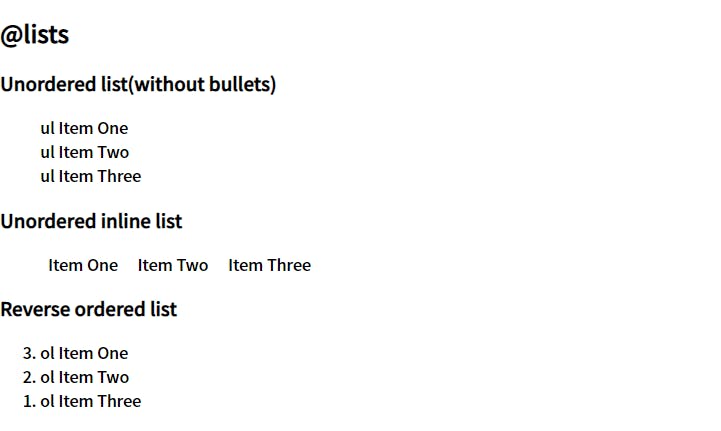 But with only HTML we will not get the above result, for that we have to add some CSS too. And codes for that is -
/* lists  */

.list-non-bullet {
    list-style: none;
}

.list-item-inline {
    display: inline;
    padding: 0rem 0.5rem;
}
We have completed the reading of four sections out of eight 😎. Now let us discuss our next section, which is an interesting one, next is the nav.
✔️ nav
A navigation bar is a user interface element within a webpage that contains links to other sections of the website.
Mostly through the navbar, users can navigate between different routes on our web page.
For different links, we can use the Unordered inline list, that we had created in the lists section. Full HTML code for nav will look something like the following -
<h2>@nav</h2>

<nav class="nav-bar container">
     <div class="nav-brand">brand name</div>
     <ul class="list-non-bullet nav-pills">
          <li class="list-item-inline">
               <a class="link link-active" href="/">home</a>
          </li>
          <li class="list-item-inline">
               <a class="link" href="/">projects</a>
          </li>
          <li class="list-item-inline">
               <a class="link" href="/">blogs</a>
          </li>
      </ul>
</nav>
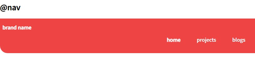
The final look of the navbar, that you will see from the Final Look link (above), is like the following -
 To get the above styling, you can add the following lines of CSS -
/* nav */

.nav-bar {
    background-color: var(--primary-color);
    color: white;
    padding: 1rem 0.5rem;
    border-bottom-left-radius: 1.5rem;
}

.nav-bar .nav-brand {
    font-weight: bold;
}

.nav-bar .nav-pills {
    text-align: right;
}

.nav-pills .link {
    color: white;
}

.nav-bar .link-active {
    font-weight: bold;
}
That's all that we have to do for our navbar, now we can discuss our next section, which is the header.
✔️ header
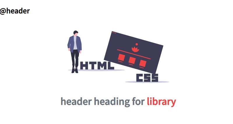
In the header, we mostly use our hero image and add some hero heading.
And for this component library, I did the same. In the HTML code for the header, I used an img tag for adding our image and an h1 tag for the hero heading. Codes for which finally looks like the following -
<h2>@header</h2>

<header class="hero">
    <img class="hero-img"
             src="./images/header-img.svg" alt="header-image">
    <h1 class="hero-heading">
           header heading for
          <span class="span">
              library
          </span>
     </h1>
</header>
To adjust the image size and to style hero heading, and for their alignment, we have to use CSS. Its code will look like this -
/* header */

.hero {
    padding: 2rem;
}

.hero-img {
    max-width: 350px;
    display: block;
    margin: auto;
}

.hero-heading {
    text-align: center;
    padding-top: 1rem;
    color: var(--dark-gray);
}

.hero-heading .span {
    color: var(--primary-color);
}
In the end, it will look like this -
 Lets we start discussing the remaining two sections for this blog. We will start with the section next.
✔️ section
For this small component library, I have included two types of sections. One with no background and one with off-white background.
They both are center containers, that we had made in the containers section.
The reason for keeping them center containers is that it does not seem good to anyone when they have to move their neck to read long text from the left end to the right end. It seems good in the center, they can read it for a long.
For HTML code, I have written some placeholder text. The codes are mentioned below for each section separately.
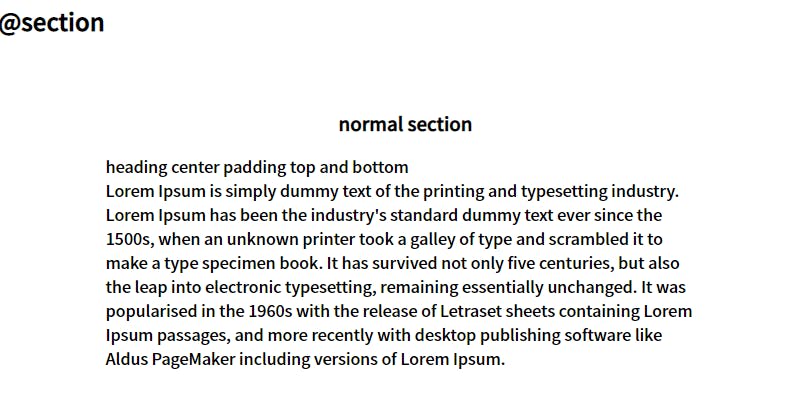
Code for Section 1 -
<h2>@section</h2>

<section class="section">
     <div class="container container-center">
             <h3>normal section</h3>
             <p>
                     heading center padding top and bottom <br>Lorem Ipsum is simply dummy text of the
                     printing and typesetting industry. Lorem Ipsum has been the industry's standard
                     dummy text ever since the 1500s, when an unknown printer took a galley of type and
                     scrambled it to make a type specimen book. It has survived not only five centuries, but
                     also the leap into electronic typesetting, remaining essentially unchanged. It was
                     popularised in the 1960s with the release of Letraset sheets containing Lorem Ipsum
                     passages, and more recently with desktop publishing software like Aldus PageMaker
                     including versions of Lorem Ipsum.
             </p>
     </div>
</section>
Final look of Section 1 -
 Code for Section 2 -
<section class="section ow">
<div class="container container-center">
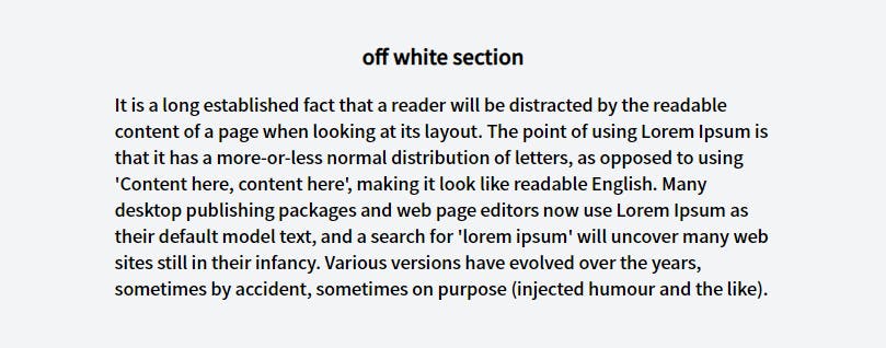
<h3>off white section</h3>
<p>
It is a long established fact that a reader will be distracted by the readable content of
a page when looking at its layout. The point of using Lorem Ipsum is that it has a
more-or-less normal distribution of letters, as opposed to using 'Content here, content
here', making it look like readable English. Many desktop publishing packages and web
page editors now use Lorem Ipsum as their default model text, and a search for 'lorem
ipsum' will uncover many web sites still in their infancy. Various versions have evolved
over the years, sometimes by accident, sometimes on purpose (injected humour and
the like).
</p>
</div>
</section>
Final look of Section 2 -
 As we had discussed that one of the sections will contain off-white background. So to do that we have to include some CSS. Code for that is given below -
/* section */

.section {
    padding: 2rem;
}

.section :is(h1, h2, h3){
    text-align: center;
}

.ow {
    background-color: var(--off-white);
}
Now lets we discuss the last section of this blog, the footer section.
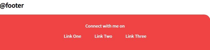
✔️ footer
a footer contains information that improves a website's overall usability.
The HTML code for footer is given below. It contains the same Unordered inline list, that we had created in the lists section. And had used in nav.
<h2>@footer</h2>

<footer class="footer container">
      <div class="footer-header">Connect with me on </div>

      <ul class="social-links list-non-bullet">
            <li class="list-item-inline">
                 <a class="link" href="/">Link One</a>
            </li>
            <li class="list-item-inline">
                 <a class="link" href="/">Link Two</a>
            </li>
            <li class="list-item-inline">
                 <a class="link" href="/">Link Three</a>
            </li>
      </ul>
</footer>
To style the footer, we need the below-mentioned CSS codes. We have given it some background color, text color, and to give it a little curve shape a top-right radius.
/* footer */

.footer {
    background-color: var(--primary-color);
    padding: 2rem;
    text-align: center;
    color: white;
    border-top-right-radius: 1.5rem;
}

.footer .link {
    color: white;
}

.footer ul {
    padding-inline-start: 0px;
}
After adding HTML & CSS codes, finally, it will look something like this -
🏁 That's all for this
Thank you for reading it till the end 🙏🏻. I greatly appreciate your patience.
feel free to connect with me on Twitter, Instagram, Github, and LinkedIn.